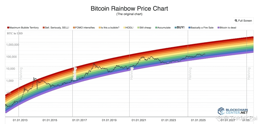
The Bitcoin Rainbow Chart is one of the most popular long-term visualization tools in the crypto market. It is designed to help investors understand whether Bitcoin appears undervalued, fairly valued, or overvalued when compared to its historical price behavior.
Unlike short-term indicators that react to daily volatility, this chart zooms out and focuses on years of price action, offering perspective rather than predictions. For beginners, it can be a powerful way to avoid emotional decisions and see the bigger picture — as long as it’s used correctly.
Key Takeaways at a Glance
The Bitcoin Rainbow Chart places BTC’s price within a series of colored bands, each representing a broad valuation zone over time. These colors are meant to reflect shifting market sentiment, from deep pessimism at the bottom to extreme optimism at the top.
It is important to understand that the chart does not provide exact buy or sell signals. Instead, it offers context — a way to compare today’s price with bitcoin’s historical growth curve. While many investors find it helpful, its reliability is still debated because it relies heavily on past data and assumptions that may change as the market matures.
What Exactly Is the Bitcoin Rainbow Chart?
At its core, the Bitcoin Rainbow Chart is a logarithmic price chart with colored bands layered on top. Each band represents a long-term valuation zone, ranging from “historically cheap” to “extremely overheated.”
A logarithmic scale is used because bitcoin has grown exponentially over time. This allows early price data and recent price data to be viewed more realistically on the same chart, without compressing early cycles into a flat line.
The goal is not precision. The goal is perspective.
How the Bitcoin Rainbow Chart Was Created
The original version of the chart first appeared in 2014, created by a Reddit user known as azop. It started as a simple, meme-style experiment — straight colored bands drawn over a logarithmic bitcoin price chart.
In 2019, a revised version called Bitcoin Rainbow Chart V2 was introduced by a community member known as Rohmeo. This updated model used logarithmic regression, creating the curved rainbow shape most people recognize today. The idea was to better reflect bitcoin’s long-term growth trend rather than forcing price into rigid straight lines.
Today, both versions of the chart are publicly available on BlockchainCenter and are widely referenced across the crypto community.
How Beginners Can Use the Bitcoin Rainbow Chart
Using the Rainbow Chart starts with one simple step:
Look at where the current BTC price sits within the colored bands.
Each color represents a general market condition:
Lower bands (blue and green): Historically undervalued zones, often seen during fear, capitulation, or long accumulation periods
Middle bands (yellow): Neutral or fairly valued conditions where the market is more balanced
Upper bands (orange and red): Historically overheated zones, often associated with hype, euphoria, and speculative excess
For beginners, this helps answer an important question:
Are we closer to fear or closer to greed on a long-term scale?
Reading the Chart in Historical Context
One of the most powerful ways to use the Rainbow Chart is to study past cycles.
Historically, when bitcoin entered the lowest bands, sentiment was extremely negative. These periods often felt uncomfortable, boring, or hopeless — yet they later proved to be strong long-term accumulation zones.
On the other hand, when price moved into the highest bands, excitement was everywhere. Media attention exploded, new investors rushed in, and confidence was extremely high — often shortly before major corrections.
That said, history does not repeat perfectly. The chart shows tendencies, not guarantees.
Why the Rainbow Chart Appeals to Long-Term Investors
The biggest strength of the Bitcoin Rainbow Chart is that it encourages patience and discipline.
Instead of reacting to every candle or headline, it pushes investors to zoom out and think in terms of cycles, adoption, and long-term growth. For people investing through platforms like Binance, this mindset can help reduce overtrading and emotional mistakes.
Combining the Rainbow Chart With Other Tools
The Rainbow Chart works best when used alongside other forms of analysis, not alone.
Many traders pair it with:
Volume analysis to confirm participation
Momentum indicators like RSI or MACD
Market structure and trend analysis
Macroeconomic factors such as interest rates, inflation, and liquidity
For example, a low Rainbow zone combined with declining selling pressure and improving macro conditions can be far more meaningful than the chart alone.
Does the Bitcoin Rainbow Chart Really Work?
This is where opinions differ.
Supporters believe the chart offers a clean and intuitive way to understand bitcoin’s long-term behavior. Critics argue that the model is backward-looking and vulnerable to breaking as the market evolves.
In fact, earlier versions of the chart had to be adjusted when bitcoin briefly fell below the lowest band — a reminder that no model is permanent or perfect.
The colors themselves are also subjective. Changing the regression parameters slightly can produce very different outcomes.
Benefits and Limitations
Benefits
Simple and visually intuitive
Helps beginners understand long-term cycles
Encourages patience over speculation
Reduces emotional decision-making
Limitations
Based entirely on historical data
Does not account for regulation, black-swan events, or technological shifts
Can create false confidence if used alone
Are There Other Crypto Rainbow Charts?
Inspired by bitcoin’s popularity, similar rainbow charts now exist for other assets, including Ethereum. While interesting, these alternatives have much shorter histories and should be treated with even greater caution.
Final Thoughts
The Bitcoin Rainbow Chart is best viewed as a map, not a crystal ball.
For beginners, it can be an excellent educational tool that builds long-term thinking and market awareness. When combined with proper risk management, additional indicators, and macro understanding, it can add valuable perspective.
But when used in isolation, it risks oversimplifying one of the most complex and evolving assets in modern finance.
In crypto, tools don’t replace thinking —
they support it.
#Binance #Bitcoin #CryptoEducation $BTC $ETH $BNB