The balance for the year 2025 is already insufficient, and soon we will be stepping into the year 2026 without any waves. To not miss out on the Alpha in the crypto field in the daily life of the new year, I Vibe Coded a 2026 Crypto Calendar.
Function Introduction:
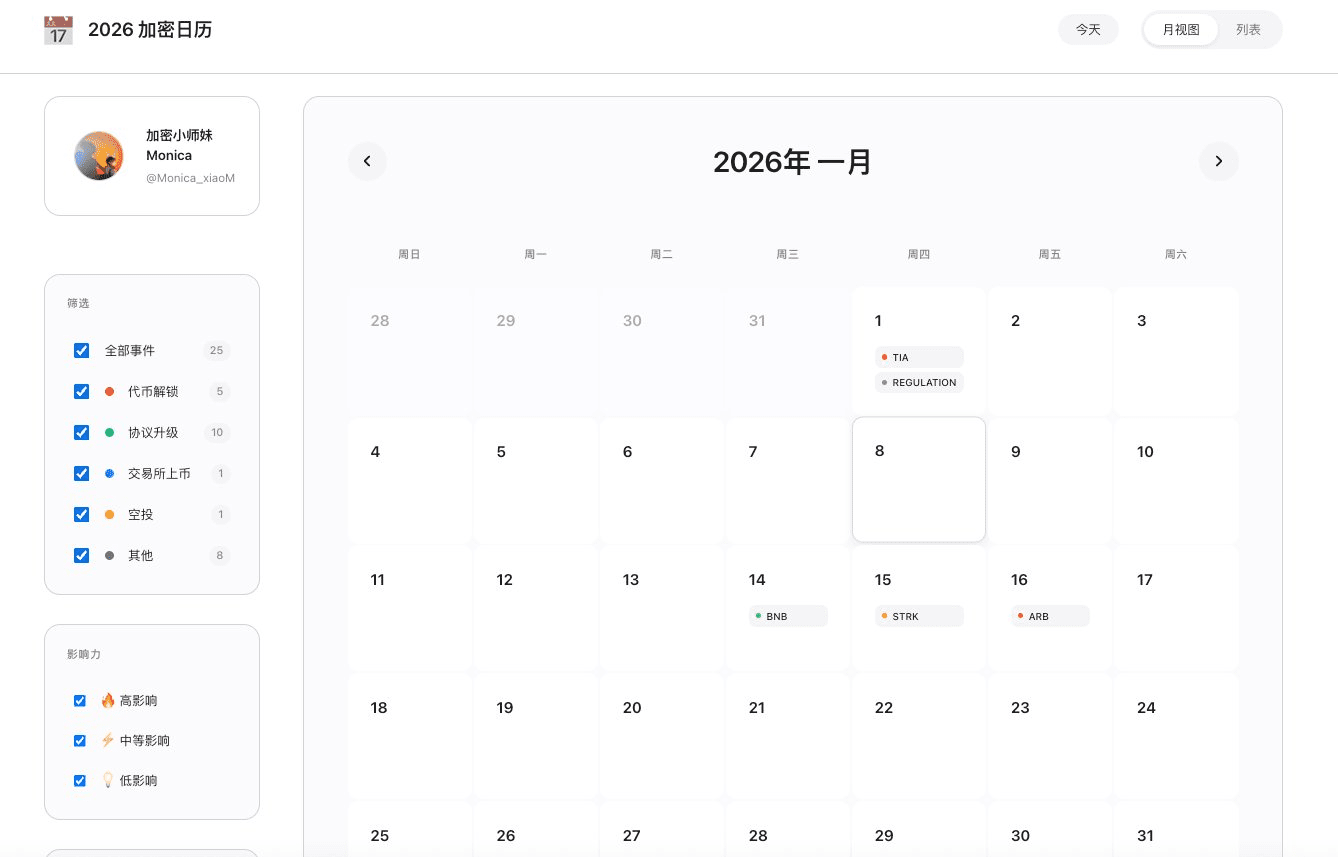
❶ Calendar function, view dates
❷ Capture trending news from the whole network
❸ Unlocking times for major tokens
❹ Reminders for significant events such as mainnet upgrades
Currently, major project parties have limited commitments for next year, and more news will continue to be updated.
https://2026-crypto-alpha-calendar.vercel.app
The functionality is not difficult to implement, but most of the effort was spent on debugging the UI. This is also something that many newcomers trying Vibe Coding often feedback to me: it works, but it looks ugly, and the more you change it, the uglier it gets.
Here, I have summarized three basic techniques and three advanced thinking strategies based on my practical experience, which may help you improve the UI of Vibe Coding.
Basic version: Three “instant” makeover techniques
Core logic: Focus on intuition rather than parameters, so that AI can understand your aesthetic.
1. Find a “rich dad”
Technique: Aesthetics are hard to describe; the fastest method is to directly specify a high-value benchmark product.
Your pain point: Describing for a long time “needs to be grand, needs to look good,” but AI still ends up creating something that looks like a 90s website.
Prompt wording: “Please fully reference the design style of 【Apple Official Website / Binance Pro Version / Linear】. I want that font, that spacing, and that color feel.”
2. Skillfully use “dark mode”
Technique: For beginners, a dark background is the best disguise; it inherently conveys a sense of technology and elegance.
Your pain point: A light interface looks very cheap if the colors are slightly off, resembling a phishing website.
Prompt wording: “Enforce the use of dark mode. The background should be black, text should be white, only the most important buttons can use bright colors, and there should be no garish colors elsewhere.”
3. Increase “white space”
Technique: The essence of elegance is wasting space. Being too cramped is the root of a tacky appearance.
Your pain point: The interface generated by AI is always crammed with information.
Prompt wording: “Please clear up the current layout. Increase the spacing of all elements by a factor of two to make the visuals look breathable and spacious, not crammed together.”
Advanced version: Three “product manager” level thinking models
Core logic: Don't teach AI how to change the code; teach it how to design interaction logic.
1. Visual hierarchy thinking
The interface cannot be all focal points. You need to control where the user's eyes look. Don't just focus on “whether it exists,” but pay attention to “how important it is.”
Instructional thinking: Tell AI to distinguish between primary information (large, bright, white) and secondary information (small, gray, dark). Core Alpha events should be highly highlighted, while secondary descriptions should be darkened. Don't let all the text compete for attention.
2. Component thinking
Don’t view a webpage as a painting; view it as building blocks. Don’t let AI change the entire page at once; it can get messy.
Instructional thinking: Let’s not worry about the overall picture first. Please design a single calendar cell component to perfection (rounded corners, shadows, labels), and then copy it throughout the entire list.
3. State thinking
UI is a living machine, not a dead poster. Elegance comes from “interaction.”
Instructional thinking: The interface needs to have vitality. There should be a glow when hovering over, and a skeleton screen when loading data. Don’t let users feel like the interface is frozen. These subtle feedbacks are the key to distinguishing “Demo” from “product.”
In simple terms, the essence of Vibe Coding is you acting as the product manager, letting AI be the technical leader. You can start with being picky, gradually developing towards planning. Another small tip is to accumulate aesthetics daily, trying to describe and understand the UI designs you feel comfortable with, so that when writing prompts, you won’t be at a loss for words.