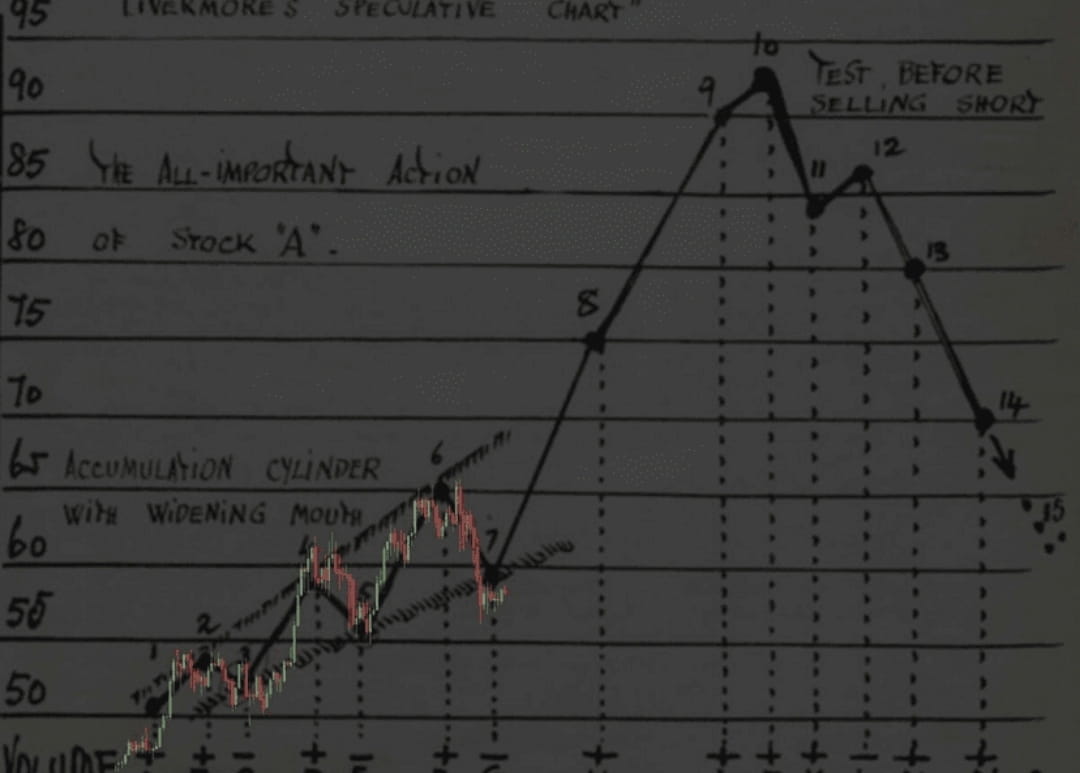
This drawing is the famous 'Livermore's Speculative Chart'.
It is based on the methods of Jesse Livermore, one of the most famous stock market speculators in history (early 20th century), the author of the classic rules for trading by trend.
Here are the main details of what is depicted in the chart:
The essence of the chart
This is a theoretical model of how a stock price behaves in different market phases. Livermore used such diagrams to identify the 'line of least resistance.'
2. Key phases in the drawing:
Accumulation Cylinder: On the left side (points 1–6) shows the consolidation phase when the price fluctuates in an expanding range. Livermore referred to this period as when large capital is building a position.
Breakout and trend: After point 7, the price sharply rises (points 8, 9, 10).
Test before selling short: Around points 10 and 12, a classic pattern of 'double top' or failed new high is shown. The inscription states that this is the ideal moment to test the market before opening a short position.
Completion of the cycle: Points 13–15 show the price collapse after the trend has reversed.
This image overlays a modern candlestick chart (red and green candles) on top of the original old drawing. Someone combined old theory with real market data to show that the principles of price movement described by Livermore over 100 years ago still work in modern markets.
For reference: Jesse Livermore is best known for Edwin Lefevre's book 'Reminiscences of a Stock Operator.' If you are interested in trading, this is considered the 'bible' for understanding market psychology.