Let's consider indicators such as: MA, RSI, MAKD, VOL, and OBV. On a 15-minute chart with examples of usage. I will say right away, there is no perfect indicator; everything needs to be used together👫 And today we will learn how to do that👍
1️⃣Let's start with the MA indicator. It stands for Moving Average, and it's not just lines; they carry important information. MA is a moving average that shows the average price over a certain number of candles.
MA7 is considered the fastest, as it shows the average price for only 7 candles.
MA25 is key; it filters out excess noise and calculates the average price for 25 candles.
MA99 is the slowest moving average, it calculates the average price for 99 candles. Example: on the 5-minute chart, 99 candles equal 8 hours😳
How will MA hint to us about a possible growth or reversal❓
📸For example, let's take the token $COLLECT
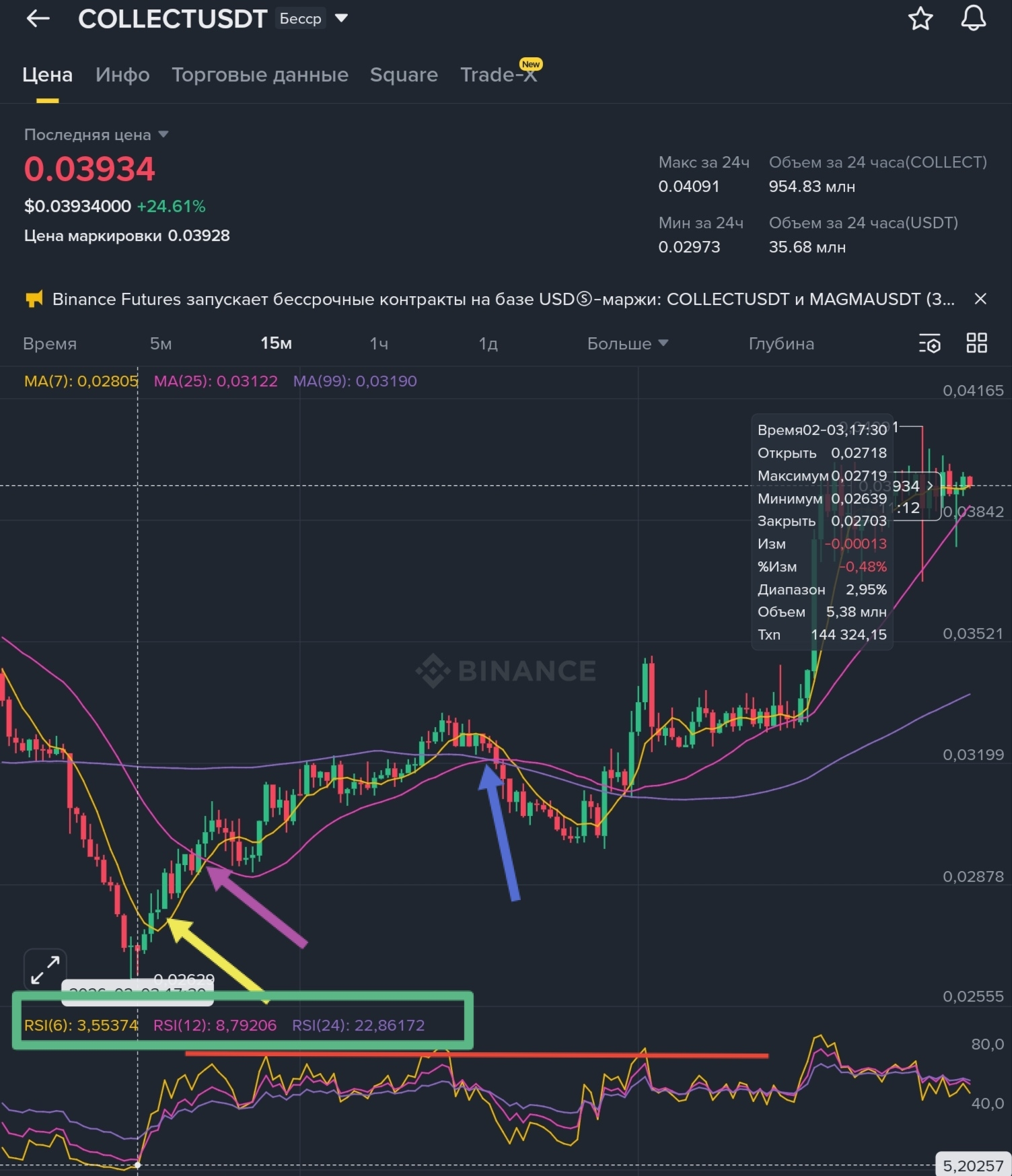
👀Look at the yellow 🟡 arrow, the candle has consolidated above MA7; this is the first bell that growth may continue; I will jump ahead, as I said, indicators must be viewed together, and in the frame, I circled the extremely low RCI that was just 2 candles ago, and this is already 2 confirmations for growth.
👀Look at the purple 🟣 arrow, at this moment MA7 breaks above MA25 from below, yes MA25 at this moment still has a downward movement, I would say from my observations that in such situations the fate of the trend change is often decided: either MA7 consolidates above MA25, or it goes back down again, which is typical when the trend is downward. The intersection zone of MA7 and MA25 is not quite suitable for buying in this example for one reason: the coin showed good growth, and in such situations, it is better to wait for a correction for buying👍 Yes, nothing terrible would have happened if you had made a purchase at this intersection; I personally choose to be less nervous, so in such a situation, I would wait for a correction👍
👀Look at the blue 🔵 arrow. Everything is great, the intersection of MA25 and MA99, the candle has consolidated above MA99, but what is wrong? 🤔Why did the decline happen?🤔 First of all, I would explain it to myself by saying that the correction was a long time ago, and obviously it is better to wait and not blindly buy at the intersection, but the RCI indicator helps in explanation; pay attention to the red line on the RCI histogram; at this intersection, the RCI value is slightly higher than at the last correction after the purple 🟣 arrow, which means it is too early to buy; you need to wait for a price drop.
2️⃣What is RCI❓ Rank Correlation Index is an indicator that shows the strength and direction of the trend by comparing: price and time, answering the question of how logical and stable the price movement is over time. Simply put, overbought and oversold of the asset. It has values from 0 to 100, but I have seen a minimum of 1.5 and a maximum of 99.7.
RCI is also calculated by the number of candles over the selected period, RCI 6 (6 candles), RCI 12 (12 candles), RCI 24 (24 candles). It is considered that RCI below 20 indicates oversold (sellers are pushing the price down and a bounce up is possible), RCI above 80 indicates overbought, possible price correction, and pullback down.
The main mistake is to look only at RCI and wait for a fall or rise; as I said above 80, this is overbought, but it often happens at 90+, oversold is about 20, but it often happens at 10, 7, 5, and even 2. It is also important to look at several timeframes; for example, on 15 minutes you have RCI 75-80, while on the hourly chart only 50, which means that in such cases a large drop and even a correction may be expected too early.
📸For example, let's take $BULLA
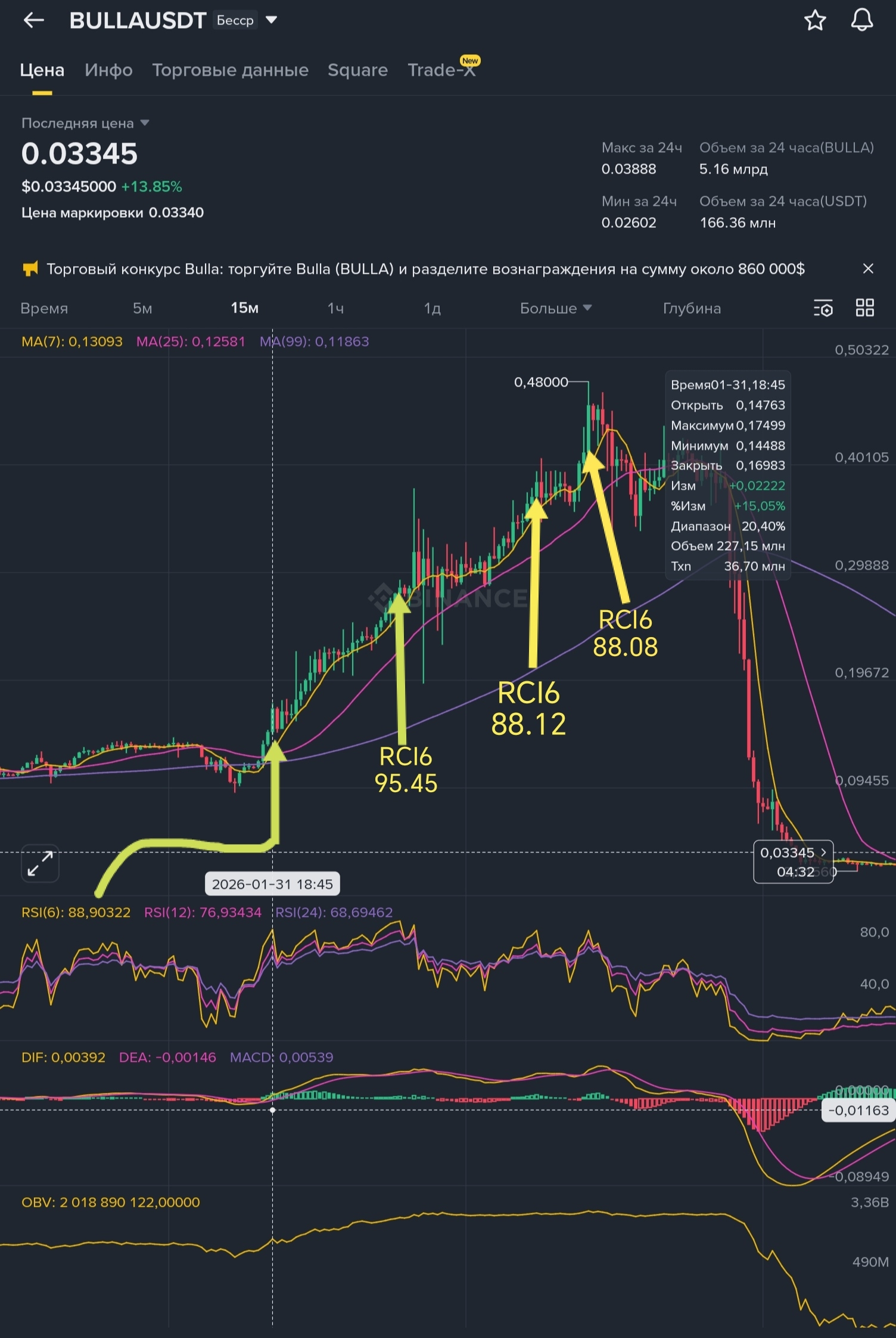
👀First yellow 🟡 arrow, RCI6 88.90 indicates overbought, while other indicators indicate continued growth, MA7 just crossed MA 25 and I will jump ahead again; the MACD dif line (yellow 🟡 line) just crossed the DEA (purple 🟣 line), despite the overbought RCI, the decline or price drop is canceled.
👀Second arrow, RCI6 95.45 is definitely the time to open a SHORT, but no, the same MACD says nothing about a decline.
As you can see from all the RCI I marked, only after the last one, the yellow 🟡 MACD line went below the purple 🟣 line and formed the largest divergence for this growth period. Below, I will explain more about MACD.
If you open the hourly chart, from the moment of my first arrow, the RCI was 75 and sometimes reached 94, and at the peak of growth, it was 92.89😳Another example that relying on one indicator is not worth it; in this situation, either look at all indicators together or build trend lines👍
3️⃣What is MACD❓ It is Moving Average Convergence Divergence - an indicator that shows: trend strength, momentum direction, and the moment when momentum changes.
On the histogram, you see first the candle blocks, red🔴 or green🟢, second, two lines yellow-dif, purple - dea. And above the lines, you see their values, for example: DIF: 0.00061 DEA: 0.00039 MACD: 0.00022.
Now in more detail:
DIF is the fast yellow 🟡 line, which is the difference between two moving averages: fast EMA7 and slow EMA99.
(The EMA indicator is very similar to MA, just if MA calculates the average for example over 7 candles, then EMA is the same average, only gives more weight to the latest prices, that's the only difference and similarity)
DEA is the smoothed average of the DIF line. More precisely, it is the EMA of the DIF line with a period of 9, which has a purple color🟣
And MACD is DIF minus DEA = some value; if the value is positive, the candles on the histogram are green🟢, if negative, red🔴. And if even simpler, as long as the yellow 🟡 line is above the purple 🟣 line, MACD is green and positive, and when the yellow line goes below the purple, MACD turns red.
A red MACD is not a signal for a decline; it just means that momentum is weakening.
When the DIF line crosses the DEA from below, the momentum increases; this is why I paid attention to MACD when I spoke about BULLA above. And actually, when the momentum weakens, the DIF line goes below the DEA.
Also, if the DIF and DEA lines are negative, it is a downward trend; if they become positive, it is a possible reversal.
📸Let's consider the example $RIVER
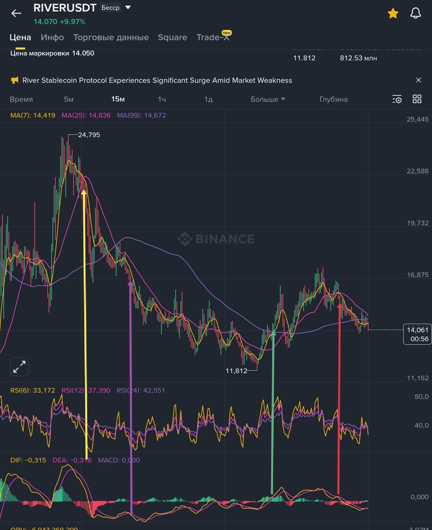
👀First yellow🟡 arrow. The candles have gone below MA25, MACD has become negative and red, 2 confirmations for a possible sale.
👀Second purple🟣 arrow. There was a recent attempt to reverse, but judging by the fact that the yellow and purple lines are below the histogram, the trend is still downward, and the DIF line is again below the DEA, the candles could not hold above MA25 and fell below MA7. Signal for a possible sale.
👀Third green🟢 arrow. The first thing I will note is that for the first time in a long time it looks like the start of a reversal because DIF and DEA have risen above the histogram, plus for the first time in a long time, the candles consolidated above MA99. Yes, the growth was not long, but this is just the beginning of a possible reversal, and RCI at this point has already decreased; of everything that was earlier, this is the best point for buying👍
👀Fourth red🔴 arrow. You see that the candles have gone below MA25, and there was an attempt on MACD for the DIF line to go above the DEA, but it did not succeed, a signal for a possible sale.
4️⃣ What is OBV and VOL. First, it is the trading volume in the asset, not in USDT, specifically the volume of the asset you are trading. Second, VOL shows you how much was traded in a specific candle, while OBV is the sum of volumes, meaning if the candle closed above the previous one, the volume increases; if below, it decreases. Thus, you see possible accumulation💰
📸Let's consider the photo ENSO.
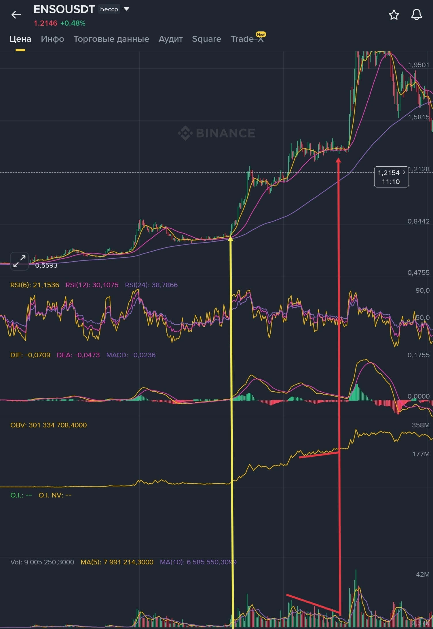
The first yellow arrow seems unremarkable; the price is almost not moving, volumes are falling, OBV seems to be standing still, but in fact, there was a slight increase in OBV first, and then VOL.
But the more interesting red arrow, the price is practically standing still, VOL is falling, while OBV is rising, this is a typical accumulation situation, and in such cases, growth is much more likely than a fall.
By the way, I look at OBV first👍
I am all done🙂Thank you all♥️