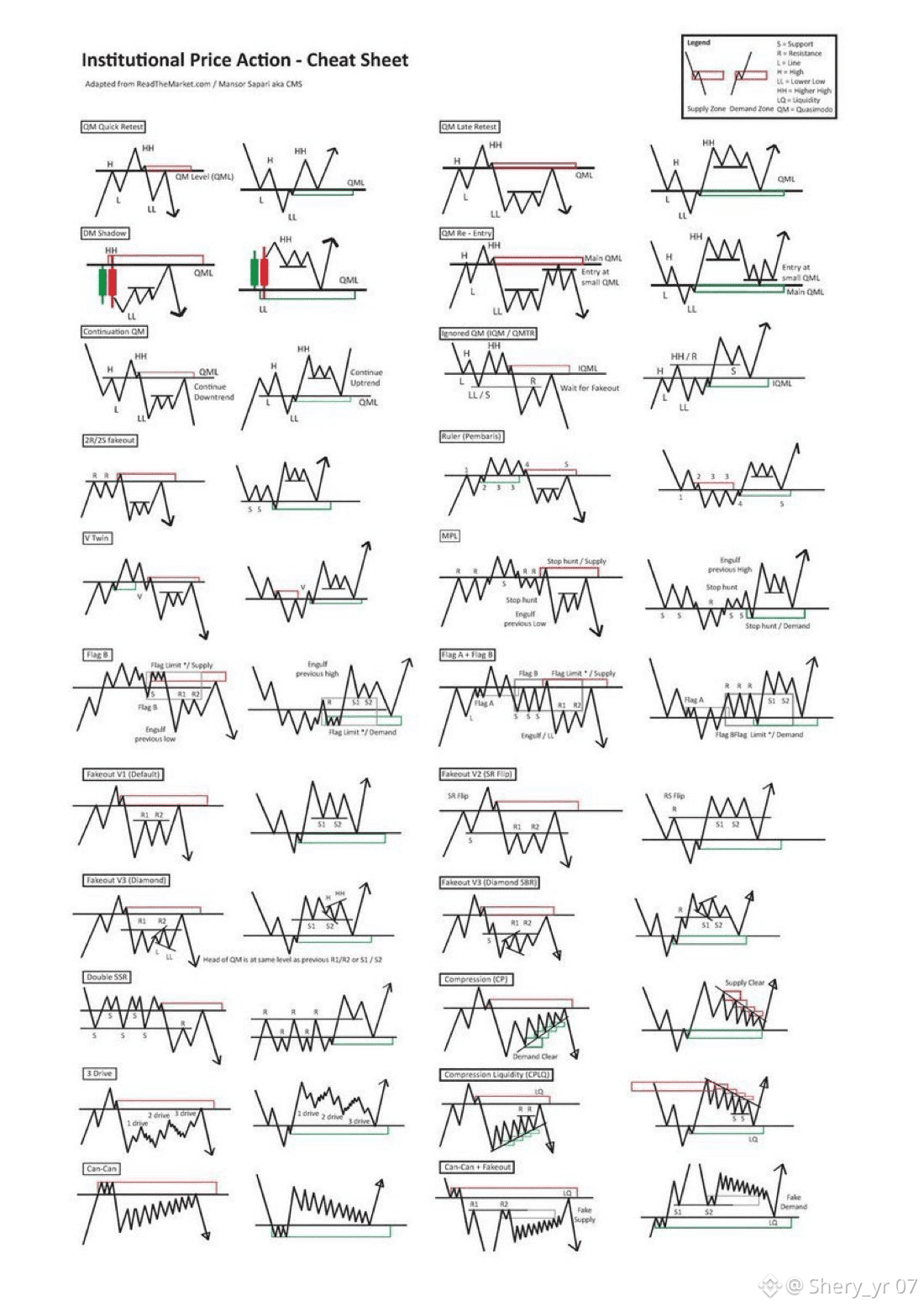
What you’re looking at in this image is how the game is actually played.
Big money doesn’t care about RSI, MACD, or whatever indicator is trending this week.
They care about where liquidity sits, who’s trapped, and how to force reactions.
Retail looks at a chart and sees chaos, but institutions see the same setups repeating over and over.
– QML setups
– Fakeouts & liquidity grabs
– Demand/Supply flips
– Compression → Expansion
– Stop hunts disguised as breakouts
– Flag limits
– Reversal structures that happen over and over again
None of this is accidental.
Every pattern on that chart exists for one reason:
to move price into areas where orders are stacked.
Once you understand that, a lot of things stop hurting you.
You stop chasing green candles, you stop panic-selling red ones and you stop getting liquidated on moves that came out of nowhere.
Because they didn’t come out of nowhere, they came from structure.
This is why most traders lose… they react to price instead of understanding why price is moving.
The people who last in this market spend years studying charts like this until they finally understood it.
After that, the market feels slower, clearer and less emotional.
Save this image. Actually study it.