$XAG Silver has become incredibly popular over the last three months — pay special attention to these three months 😉
I haven’t traded silver for a long time, but at the request of friends, I decided to analyze what’s really going on with it.
👉 So before I start adding any markings to the chart, please focus on the Annual Silver Chart.
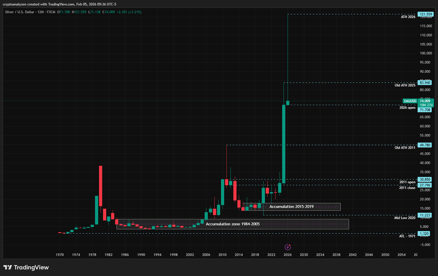
📊 Annual Chart
The accumulation zone from 1984–2005 is very noteworthy.
That period coincided with the appearance of the first computers, cordless phones, flat screens, and the replacement of electronic circuits with chips — and this is when demand for silver first began to increase.
The second accumulation zone (2015-2019) formed just before the advent of artificial intelligence 😉
At that time, forecasts appeared about a future increase in silver’s value due to the development of new technologies.
Now look at the decline in silver’s price in 2020:
AI became a hot topic, chip demand exploded — but the general public was still asleep. As a result, the price was easily pushed down to the 2009 opening level, where large-scale silver buying originally began.
At the beginning, the trend developed as it always does:
➡️ A new high → a sharp pullback
➡️ A new high → a sharp pullback
2025 was a key year for silver.
I especially want to draw attention to the 2025 candlestick for those who rushed to buy silver recently out of FOMO 😉
📌 In 2025, the price rose from 28 → 83
📌 In January 2026, the rally continued due to strong public FOMO, and a new all-time high at 121.559 was formed.
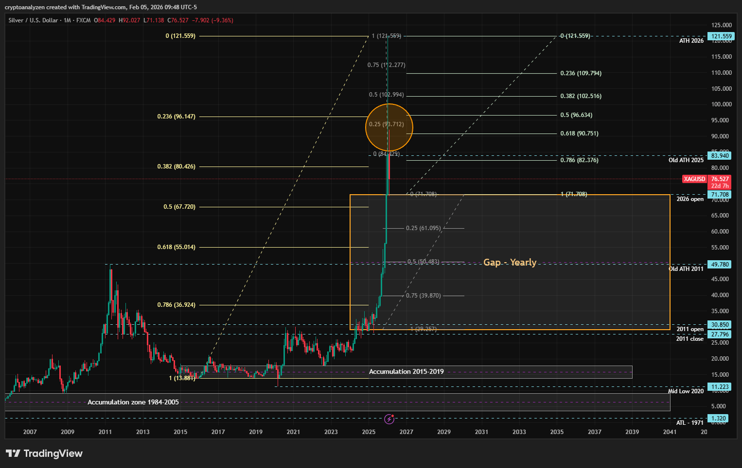
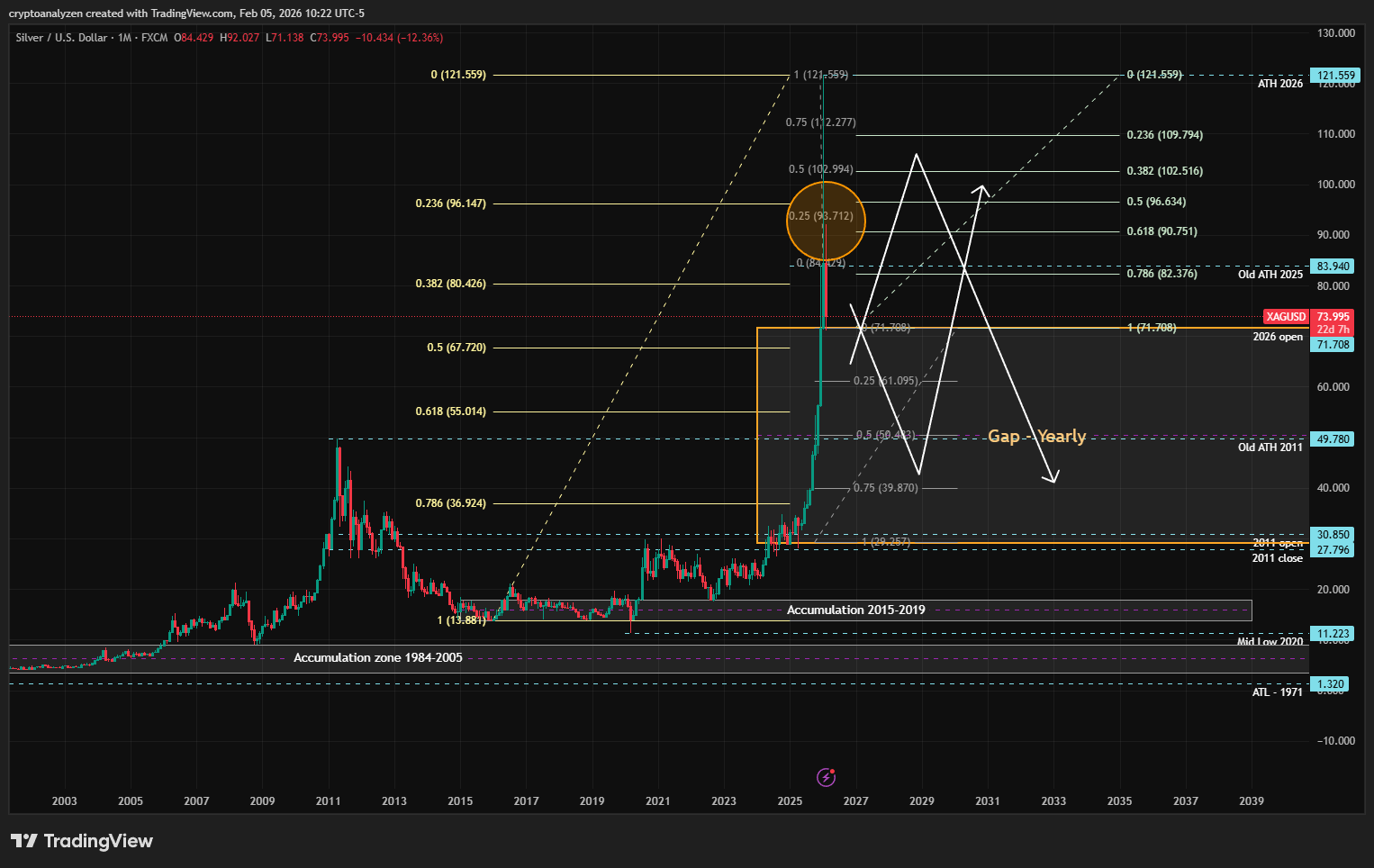
📈 Monthly Chart
The impulsive upward move began in June 2025.
In other words: quiet accumulation during the first five months of the year → a sharp rise → a gentle pullback in December → then another push up with a sharper pullback in January 2026.
The January 2026 candle closed almost exactly at the old 2025 all-time high, at the 23% Fibonacci level of the entire monthly range, and left a long upper wick — which is more typical of a potential reversal.
In the first days of February, about 25% of that upper wick was already tested, followed by a strong pullback to the January opening level.
All of this points to a high probability of price moving down into the 2025 gap zone, marked below.
📌 The middle of that gap aligns with the old 2011 all-time high: 49.78
If price enters the gap zone, don’t rush into buying until the old 2011 ATH is tested.
✔️ Ideally, wait for a decline to at least 75% of the gap → 39.87
At the same time, if a new ATH forms (even temporarily), we may first see a test of the upper-wick levels of the January candle, either before or after the drop into the gap zone (as shown on the last chart).