Cryptocurrency markets are characterized by high volatility, rapid liquidity shifts, and continuous global trading cycles. Platforms such as Binance provide advanced charting interfaces that allow users to monitor price behavior in real time. However, many new participants lack a methodological understanding of chart interpretation.
This tutorial provides a systematic introduction to how to read crypto charts, focusing on visual price interpretation, trend identification, and basic technical indicators. Designed for beginners, the article explains foundational chart structures and applies them to a real-world Bitcoin example. The objective is to support informed decision-making through structured crypto chart analysis rather than speculation.
1. Why Charts Matter?
Cryptocurrency prices rise and fall based on supply and demand. A chart is simply a visual tool that shows how price changes over time.
Basically, charts help users:
See if a coin is rising or falling
Identify possible trend changes
Understand market behavior before buying or selling
Learning basic crypto chart analysis means learning how to observe price movement logically instead of reacting emotionally.
2. Basic Chart Types on Binance
When you open a coin on Binance and tap the chart, you will see different chart types. The two most important are:
2.1 Line Chart
A line chart connects closing prices over time.
If the line slopes upward → price is generally rising
If it slopes downward → price is generally falling
Line charts are simple and useful for seeing the overall direction.
2.2 Candlestick Chart
A candlestick chart shows more detailed information.
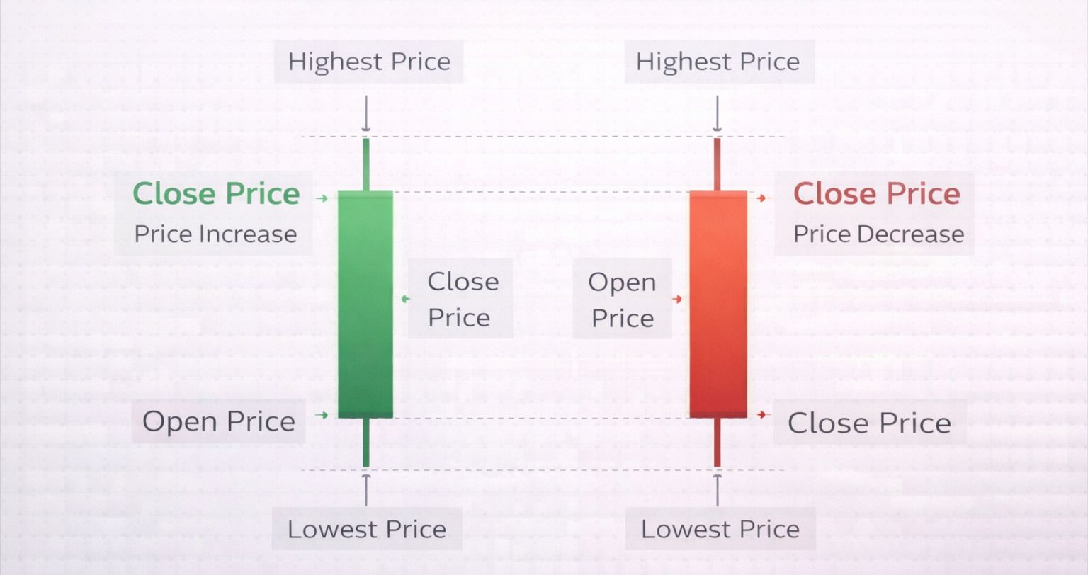
Each “candle” represents a period of time (for example, 1 hour or 1 day) and shows:
Open price (where price started)
Close price (where price ended)
Highest price
Lowest price
If the closing price is higher than the opening price, the candle is usually green (price went up).
If the closing price is lower than the opening price, the candle is red (price went down).
Long green candles suggest strong buying. Long red candles suggest strong selling.
Candlestick charts are more useful than line charts because they show more information about market strength.
3. Understanding Timeframes
A timeframe is the length of time each candle represents.
On Binance, you can choose: 1 minute, 15 minutes, 1 hour, 4 hours or 1 day
Short timeframes (like 1 minute) show small price movements and can look chaotic.
Longer timeframes (like 4-hour or daily charts) show the bigger picture.
Beginners should start with 4-hour or daily charts because they are easier to understand and less stressful.
4. How to Identify a Trend
A trend shows the general direction of price.
4.1 Uptrend (Bullish Trend)
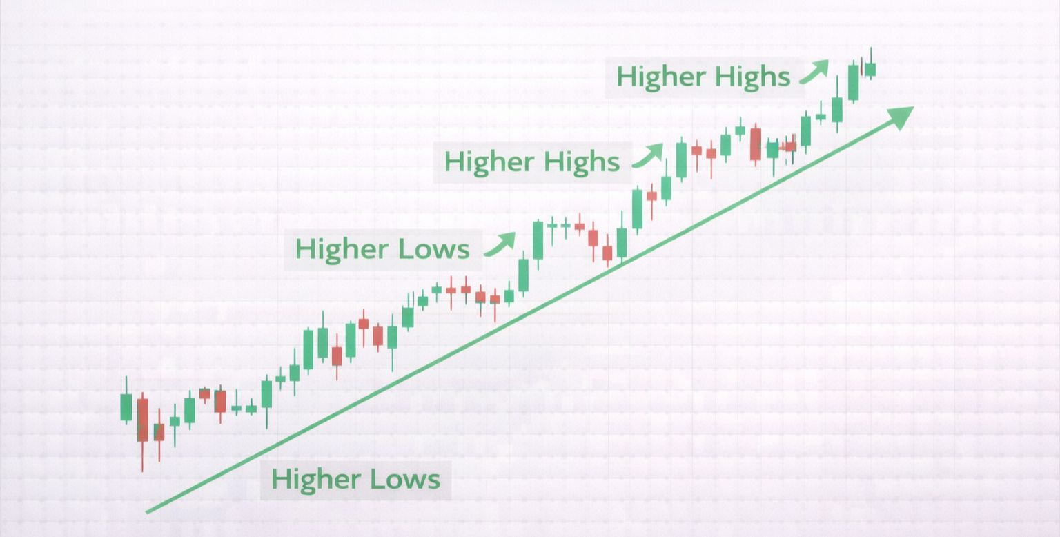
An uptrend happens when:
Price makes higher highs (new peaks)
Price makes higher lows (pullbacks that stop above the previous low)
This means buyers are stronger than sellers.
4.2 Downtrend (Bearish Trend)
A downtrend happens when:
Price makes lower highs
Price makes lower lows
This means sellers are stronger than buyers.
4.3 Sideways Market
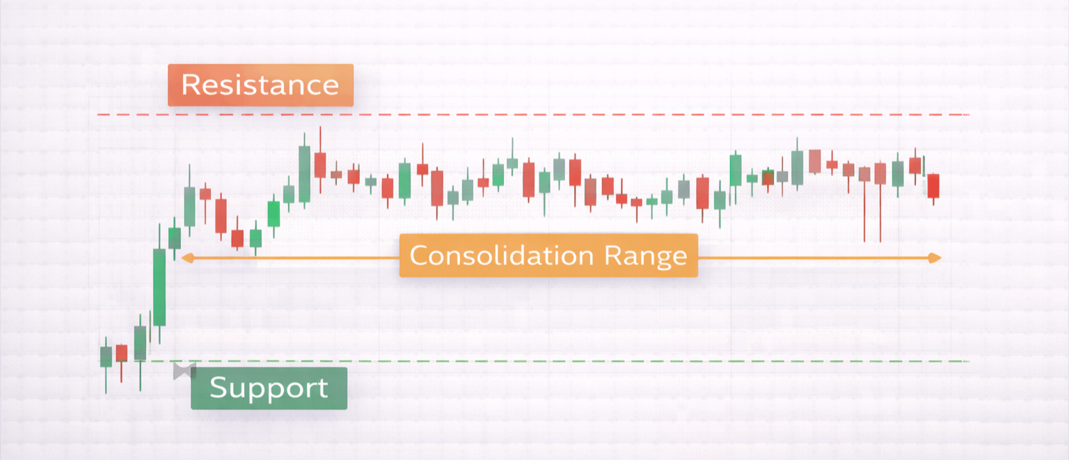
Sometimes price moves inside a range without going clearly up or down. This is called consolidation (a resting period before a bigger move).
Recognizing trends is the foundation of learning how to read crypto charts.
5. Simple Indicators on Binance
Indicators are tools added to charts to help interpret price movement. Beginners should limit themselves to one or two indicators.
5.1 Moving Average (MA)
A Moving Average shows the average price over a specific number of periods.
For example: MA 20 = average price of the last 20 candles
It creates a smooth line that helps identify direction.
If price stays above the Moving Average → market may be strong.
If price stays below it → market may be weak.
The Moving Average helps reduce noise (small random price movements).
5.2 Volume
Volume shows how many coins were traded in a specific period.
High volume = many traders are active.
Low volume = fewer participants.
If price rises with strong volume, the move is usually stronger.
If price rises with low volume, the move may be weak.
6. Practical Example: Observing a Bitcoin Recovery
Imagine Bitcoin drops quickly over several days. On the chart, you would see:
Several red candles in a row (strong selling).
Increasing volume (many traders participating).
Price stops making new lows.
Green candles begin forming.
Price crosses above the Moving Average.
This combination may suggest that selling pressure is weakening and buyers are returning.
However, this does not guarantee that price will continue rising. It only shows a possible change in direction.
7. Risk Considerations
Charts help you understand market structure, but they do not predict the future.
Cryptocurrency markets are highly volatile (meaning prices can move very fast in either direction). News events, regulations, global economic changes, and investor emotions can all impact prices suddenly. Even strong chart patterns can fail.
Beginners should:
Avoid investing money they cannot afford to lose
Start with small amounts
Focus on learning before focusing on profit
Chart reading is a skill that improves over time.
To summarize, learning how to read crypto charts is about understanding visual price behavior, not predicting the future with certainty. By mastering this, beginners can build a structured approach to crypto chart analysis.
Clear observation, patience, and risk awareness are more important than complexity. In fast-moving 2026 markets, simple and disciplined chart reading remains one of the most valuable foundational skills.